ext_1836 (![[identity profile]](https://www.dreamwidth.org/img/silk/identity/openid.png) rigel-7.livejournal.com) wrote in
rigel-7.livejournal.com) wrote in ![[community profile]](https://www.dreamwidth.org/img/silk/identity/community.png) fandom_grammar2008-05-10 04:45 pm
fandom_grammar2008-05-10 04:45 pm
Entry tags:
Feature: Presentation and readability for LJ and beyond
Navigation Menu
Introduction
HTML: Italic | Bold | Underline | Superscript | Strike | Center | Horizontal Rule | Line Break | Paragraph | HTML Quick Reference Guide | Separators | Killing Microsoft Word "smart quotes" | ASCII special characters | ASCII Quick Reference Guide
Livejournal: lj-cut | Formatting: style=mine, format=light | Manage Journal Styles | Layout tips
CSS: Paragraph | Text-Align | Font-Family | Font-Size | Font-Color | Line Height | Margin and Padding | Horizontal Rule | Backgrounds | CSS Quick Reference Guide
Publishing to a website: Doctype declarations and encoding | Validating code
More handy links!
Introduction
We've all come across it before; we've clicked that link in anticipation of fic only to be confronted with the most hellish LJ layout conjured from what can only be surmised as the mind of a deranged, colour-blind person.
It's the dreaded sight of hot pink text on a black background, or red text on black, or a teeny tiny font that gives you a headache while you squint at the screen, or a strange medieval-esque font where all the F's look like S's, or there’s a horizontal scroll bar of doom (ack!) requiring acrobatic mouse maneuvers to follow the story…
In short, it's back-button city because you can't bear to assault your eyes any further. Alas, there may have been a great fic in there after all and you would never know it, judging from the train wreck first impression!
So, here are a few tips and tricks that you can use to make your fic as reader friendly as possible.
HTML
Italic | Bold | Underline | Superscript | Strike | Center | Horizontal Rule | Line Break | Paragraph | HTML Quick Reference Guide | Separators | Killing Microsoft Word "smart quotes" | ASCII special characters | ASCII Quick Reference Guide
Return to main menu
HTML (Hyper Text Mark-up Language) is wot the interwebs is made of.
Put simply, it's the language that tells your browser (Internet Explorer, Firefox, Safari etc) what to display. HTML markup tags are used to alter how content is displayed (eg. by making a word bold, or italicized).
Content is always surrounded by an opening tag and a closing tag. Note that there is no "whitespace", or gaps between the tags and the content. The closing tag also contains a backwards slash "/" - signaling "end", or "close".
<openingtag>This is content</closingtag>
If you forget to close a tag, you'll soon see the error of your ways! The rest of your document will be rendered as whatever tag you've left open. A whole page of bold formatted text is very difficult to read.
This is a short guide to the most common HTML tags that you will use while writing fic.
Italic
The italic tag is used to create italicized text:
<i></i>
<i>This is italicized text</i> produces: This is italicized text
The italic tag is deprecated, that is, you can still use it - browsers will still render text in italic, but it is seen as an older "dinosaur" type tag because it refers to a stylistic element ie. presentation rather than content. It is a formatting tag.
It has been replaced with a semantic tag. A tag that is descriptive of the content.
The emphasis tag tells the browser that the content is important, is emphasized, is stressed just as in verbal speech.
The emphasis tag:
<em></em>
<em>This is emphasized text</em>produces: This is emphasized text
Visually, this tag produces the same result as <i></i>, that is, the text is still rendered as italic. But it is fast becoming the preferred markup method, because it conveys meaning as well as a visual style.
Bold
The bold tag is used to create bold text:
<b></b>
<b>This is bolded text</b> produces: This is bolded text
The bold tag is also deprecated, and has been replaced by the strong tag.
The strong (strong emphasis) tag:
<strong></strong>
<strong>This is strong emphasized text</strong> produces: This is strong emphasized text
Underline
The underline tag is used to create underlined text:
<u></u>
<u>This is underlined text</u> produces: This is underlined text
Underlining text should be avoided wherever possible. This is because most web browsers, as a default, present links as underlined text. It can become confusing to the casual reader and distracting when overused.
To indicate emphasis or importance, use either <em></em> or <strong></strong> instead.
Superscript
The superscript tag is used to create ordinal notations, or text that is lifted above the baseline:
<sup></sup>
The 1<sup>st</sup> of July produces: The 1st of July
Strike
The strike tag is used to create text with a strikethrough:
<s></s>
<s>This is strikethrough text</s> produces:
As with the underline tag, strikethrough should be used sparingly as it can become difficult to read in long extracts.
Center
The center tag is used to create centered text:
<center></center>
<center>This is centered text</center> produces:
The center tag is also deprecated and has been replaced by the use of an enclosing div with a center align command.
A div (<div></div>) is a container element. Think of them as building blocks for a website. They are used to contain elements of the webpage and then are styled using CSS, which dictates all of the presentation. If you ever look at the source code of your LJ, you will notice that it is created using divs.
<div align="center">This is centered text</div> produces:
This is centered text
Centered text should also be used sparingly. (I mean, have you ever tried to read a fic that is all center aligned! GAH!) It is most commonly used in conjunction with other tags for presentation purposes - for things like dividers or images. Many writers also choose to center the title of their fics.
Horizontal Rule
The horizontal rule tag produces a horizontal line across the body of an element. This tag does not require an end tag and does not enclose any content:
<hr>
<hr> produces:
Rather ugly isn't it? However, fanfiction.net now encourages the use of this element as a way to indicate a scene change. (See also: Separators) You can use CSS to make the horizontal line less intrusive (See also: Horizontal Rule (CSS))
You can also embed formatting within the tag itself using inline CSS, so that if people view your fic via their own LJ style, the formatting is preserved.*
<center><hr width="50%"></center>:
Produces a horizontal line break that is centered and 50% of the original width:

*Note: LJ's default comment page will strip this coding and display a regular horizontal line.
Line Break
The line break tag forces a break in content. It shifts content from one line, to the line below. In other words: a single carriage return.
You won't need to use this tag for formatting fic for LJ, as the update journal field automatically interprets you hitting "enter" as "make a line break". Like the <hr> tag, it does not require a closing tag or enclose content:
<br>
Content on one line<br>Shift content to the next line, produces:
Content on one line
Shift content to the next line
You would use this tag while formatting content for a website. Although you can laboriously use the <br> tag to create double carriage returns to separate paragraphs throughout your fic, it is lazy markup. Instead you should use the paragraph tag combined with CSS. (See also: Paragraph (CSS))
Paragraph
The paragraph tag is used to enclose content that is separated into a paragraph. This is not a tag you will need to use while formatting fic for LJ.
<p></p>
<p>Lorem ipsum dolor sit amet, consectetuer adipiscing elit. Morbi venenatis tempus enim. Mauris tincidunt. Nullam lobortis. Curabitur ultricies mi et velit. Nulla varius varius quam. Pellentesque tincidunt porttitor ante. </p> produces:
Lorem ipsum dolor sit amet, consectetuer adipiscing elit. Morbi venenatis tempus enim. Mauris tincidunt. Nullam lobortis. Curabitur ultricies mi et velit. Nulla varius varius quam. Pellentesque tincidunt porttitor ante.
(The example isn't noticeable here on LJ, but trust me - you'll need this tag for websites)
When formatting for a website, you will have to go through your fic and add a paragraph tag to each and every one of your paragraphs - this forces "whitespace" between paragraphs, making it easier to read. Reading a document online is different to reading one presented on paper. A wall o' text can be a difficult thing to decipher from a screen.
However, when inputting fic into LJ's handy dandy update field, you can format your paragraphs before you cut 'n paste from Microsoft Word or your word processing program of choice by creating this "whitespace" manually. Thus, when you come to the end of a paragraph, locate the enter key and press it twice. Congratulations! You have mastered the art of the double carriage return.
This is probably a habit that you're already accustomed to *winks*, but it never hurts to have a reminder!
You may be tempted to create fancy paragraphs, by "indenting" via the handy HTML spacer command, (or for advanced people, via CSS and the paragraph tag). This is a BAD idea. Reading text on a computer monitor is different to reading from a printed page. The width of a paragraph on the net is usually far wider than that of a book, and by convention, paragraphs are double spaced. Indented paragraphs become distracting as they interrupt the flow of text.
HTML Quick Reference Guides
For further reading, these guides are recommended:
html-reference.com
W3 Schools quick list
htmlcodetutorial.com quick list
Separators
Separators are a vital visual marker for your reader. They are most commonly used as a scene change indicator, forcing the eyes to rest, before resuming reading.
In the above section, you will have noted the <hr> tag as being a useful way of creating a separator. However, it is supremely ugly, in that it's a very intrusive way to indicate a scene change. Personally, I feel the only time a horizontal rule is warranted is when separating the header of your fic from the main body.
One way to mitigate the awful stark quality of the line is via inline styling to make it centered and about 30 - 50% as wide as the default. (See also: hr), or you can set the <hr> styling through your CSS stylesheet (See also: hr (CSS))
For the adventurously minded, an embedded image could be used.
<center><img src="http://i64.photobucket.com/albums/h182/rigel_orion/LJ/separator1-2.png"></center>, would produce:

Personally, I vastly prefer the use of a subtle combination of characters. Note the use of the word subtle there… A separator should be 3 - 5 characters long at the most, any more can be distracting.
*** : the old favorite, triple asterisk
-|- : dash, vertical line, dash
~~xooOXXOoox~~ : *cough*, well… I think it looks ugly.
You can center a separator using the center tag (See also: center), or leave them left aligned.
Fanfiction.net has recently stripped all special characters from use, intending for users to instead implement the <hr> tag. This means no asterisk, no dash, no vertical line, no anything! And worst of all, you can't alter the line at all with inline styling.
The choice is to either suck it up and deal, or use a combination of letters such as xXx or letters and numbers o0o
Killing Microsoft Word "smart quotes"
Copying and pasting directly from Microsoft Word into LJ can cause problems. And publishing an HTML page directly from Word is even worse!
If you have e-mail notification turned on and you receive a comment to a fic, you might have noticed a little something. Your fic looks, odd in the body of the e-mail. The apostrophes, emdashes, quotation marks, ellipses, superscript and special characters are all gobbledegook!
This is due to Microsoft Word attaching "smart" features to its documents. When you copy and paste directly into the update LJ field; these "smart" characters are also imported. The trouble is that HTML (the language web pages are built with) doesn't quite recognize what these "smart" characters are and converts them into the non-standard whacked out bits and pieces.
This may not bother you entirely, as everything looks fine on the screen in LJ / your website - but on devices such as palm pilots, mobile phones, pda's or text only browsers… well - your fic will look screwy. And you want your fic to be read by as many potential readers as possible, don't you?
This is easily fixed! You simply have to tell Word not to use its pesky "smart" features. For PC, go to "Tools", select "Auto Correct Options" and then select the "Auto-Format" tab and then deselect all of the "Replace as you type" options. For Mac, go to "Tools," select "Auto Correct" and then select the "AutoFormat As You Type" and "AutoFormat" tabs and then deselect all of the "Replace as you type" options.
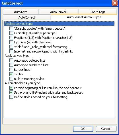
(click to enlarge)
Kill them! Kill them ded.
You can also reformat existing fics, by highlighting the entire document and repeating the above steps.
NEVER EVER publish a HTML page directly from word (File -->Save as Webpage). The program has an incredibly whacked out way of generating code that is messy, a nightmare for some browsers to follow and is bloated with useless tags and information.
Instead, copy and paste into a text editor, like notepad and then save as HTML, or - if you're lucky enough to own a copy - use a specific web page building program like Dreamweaver or Adobe GoLive.
EditPlus is a fantastic code editor that comes with a free 30 day trial if you'd like something a bit more sophisticated than notepad. (It color codes for you, making it easier to identify tags!)
ASCII special characters
You've killed the smart tags - but what about special characters? Things like the em-dash, accented letters, the copyright symbol etc. How can you make sure these display properly? And what if you actually prefer "curly" quotes to "straight" quotes? Or apostrophes that look like apostrophes?
To create valid markup code, you need to use the HTML name, or HTML number for the specific ASCII character.
Here is a handy online chart that lists some of the more common characters: Special HTML characters A List Apart's article on special characters is also worth a read.
Insert the HTML code directly into the body of the text:
“Hello Aunt Felicité,” said Caroline ’s sister. gives:
“Hello Aunt Felicité,” said Caroline’s sister.
Of course, it becomes incredibly unwieldy to type out code for every special character you wish to use (not to mention a nightmare for any beta to wade through and decipher). So use the search and replace function in Word to hunt out special characters just before you post. (Edit --> Replace (Ctrl + H))
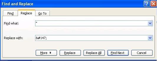
(Click to enlarge)
ASCII Quick Reference Guides
For further reading, these guides are recommended:
asciitable.com
asciicode.com
Return to main menu
Livejournal
lj-cut | Formatting: style=mine, style=light | Manage Journal Styles | Layout tips
Return to main menu
Publishing fic to Livejournal is relatively easy. You don't need to be a whiz at coding and many of the Livejournal features are user friendly. Here are a few tips and tricks to make your fics the best that they can be on this platform.
lj-cut
The livejournal cut is the first LJ specific piece of code that you should memorize. This piece of code is a courtesy feature allowing you to shorten the appearance of a long entry. It "hides" content from view and creates an automatic link that is used to access the hidden content when clicked.
The lj-cut turns a HUGE scroll worthy epic on a friendslist to a far more accessible short entry. Dont forget to close the cut tag after the main body of the fic if you want additional text to appear outside the cut.
<lj-cut>Content to be hidden here</lj-cut> or <lj-cut text="cut text goes here">Content to be hidden here</lj-cut>
Fic conventions on LJ have evolved into a template. When posting fic, your header containing information (title, author, fandom, rating etc) is listed first and then the fic itself is hidden behind an lj-cut.
Formatting: style=mine, format=light
LJ allows custom comment pages. Depending on the viewing options you have selected for your journal, when you click a link to a fic published on LJ you might view it in your own layout, or the layout of the other LJ.
It helps to have options - particularly if you come across a layout that is hard to read, or if your own layout isn't reader friendly either.
?style=mine
Presents the content in your own layout, or for a reader, in their own layout.
?format=light
Presents the content in a stripped back default style. This is a good option if your fic, or entry has lots of images.
You need to add these suffixes to the URL of the entry:
http://community.livejournal.com/fandom_grammar/698.html?style=mine
http://community.livejournal.com/fandom_grammar/698.html?style=light
You may wish to present a potential reader with these options when linking to your fic from an announcement community, or present them beneath the header of your fic. To place them underneath the header, publish the entry and then edit the post after copying the newly generated URL.
<a href="URL to fic?style=mine">Read this fic in your own layout</a> or <a href="URL to fic?format=light">Read this fic in a light format</a>, gives:
Read this fic in your own layout or Read this fic in a light format
From the lovely
Zap Bookmarklets - Drag one of these handy bookmarklets to your bookmark toolbar and click on them to disable colors, stylesheets and more.
Or (in Firefox):
Create a new bookmark in your tool bar ( Right Click on the toolbar and select "New Bookmark")
Name it something like style=mine
In the "location" field, enter the following:
javascript:if(location.hostname.indexOf('livejournal.com')%20>=%200){location.search+=(location.search?'&':'?')+'style=mine';}
And, hey presto - if you want to read a fic in your own layout, press the bookmark and it will refresh for you.
For format=light:
javascript:if(location.hostname.indexOf('livejournal.com')%20>=%200){location.search+=(location.search?'&':'?')+'format=light';}
Manage Journal Styles
LJ has a large and flexible set of journal layout options. You can customize your LJ in the "customize LJ" area:
http://www.livejournal.com/customize/
This is where you can browse for and apply themes to your LJ and then tweak them further by changing colors, adding custom text, positioning the sidebar etc. After choosing your theme, you may wish to tinker with the CSS. Simply navigate your way to the CSS input box (handy screenshots follow).


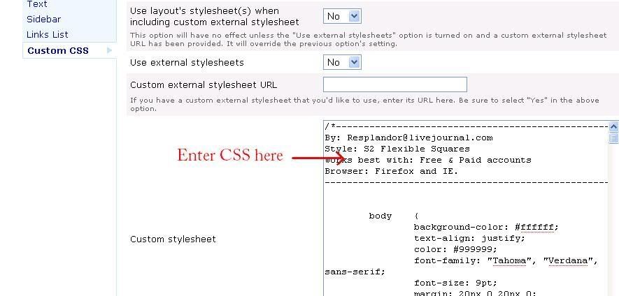
(Click to enlarge)
This box is where you will enter CSS overrides that will change the styling of your LJ layout.
The CSS selectors that you can alter and play with will depend largely on the theme that you have chosen. There are specific theme communities on LJ that will help you change your CSS like
The paragraph selector, however, is universal and in the next section, I'll show you some things that you can do to make the text of your fic reader friendly. (See also: CSS)
If you're not confident with changing CSS, find a pre-made layout that comes with the CSS already altered and add your own images - or stick to a default theme.
Layout tips
Layouts are fabulously fun to play around with! But not every layout is presentable for publishing fic. If you don't want to compromise your fabulous LJ setup in favor of readability, then consider giving the reader alternative links to "format=light" or "style=mine" options. (See Formatting: style=mine, format=light)
But if you are amenable to a friendly layout, here are some guidelines:
1. Choose a layout that has a decent entry width.
| have you ever tried reading a fic that makes your eyes jump from line to line on every fourth word making it seem disjointed and sounding robot-like in your head? |
As a rule of thumb, don't go for a layout that has an entry width of less than 500px.
2. Choose a layout that has a decent color scheme.
Taste is, of course, subjective. But in terms of readability stay away from color schemes that incorporate bright or neon colors as either page backgrounds or text colors. If you think the computer monitor could be blinding from 20 paces; that color combination might be a tad over the top.
Schemes that are too similar are also problematic (eg. light pink on dark pink, yellow on orange etc), as the eye can have trouble discerning between the color values. A good way to check this is to "greyscale" the layout (remove the color so that it shows in black and white) - you can do this in a graphics program like Photoshop. (Take a screencap of the layout (Print Screen key on your keyboard) and then paste it into a new document in Photoshop. Image --> Mode --> Greyscale) If you have trouble reading text, then you know that the color values are too close.
graybit.com - This is a fantastic online tool that will convert any existing webpage to greyscale so that you can test for readability.
3. Choose a layout with a good font size. (This can be changed via CSS - see also: Font Size.)
A 6px font can look stylish, but can be very hard to read - particularly for fic. Conversely 16px font can make it look like the monitor is shouting at you.
A font size from 9 - 14px is recommended, with 10px being the industry default.
4. Choose an S2 layout.
An S2 style allows you to "tag" your entries and display links to tags in the sidebar. It's good to get into the habit of tagging your fic so that readers can find more of your work.
5. Avoid animated headers / lots of blinkies in the sidebar.
These can take too long to load for people on dialup and can be distracting to readers.
6. Choose a navigable layout.
Make sure that someone dropping by your LJ can find where to leave a comment, how to find more of your work, how to see your profile etc.
Return to main menu
CSS
Paragraph | Text-Align | Font-Family | Font-Size | Font-Color | Line Height | Margin and Padding | Horizontal Rule | Backgrounds | CSS Quick Reference Guide
Return to main menu
At long last, we come to CSS!
CSS stands for Cascading Style Sheets and is a web language used to affect the styling or presentation of a web page.
CSS is very different from HTML. It uses an entirely different syntax. It is composed of a selector that is then followed by a block of declarations separated by semi colons and then enclosed between two curly braces. These tell the browser how to style the selector.
A typical CSS element would look like this:
.selector {
declaration: value;
declaration: value;
declaration: value;
}
Note the curly braces and the semi-colons - these are important. If you forget to close a bracket or place a semi-colon the code won't work.
On LJ, there are many different selectors that you can tweak, and if building your own website you can create as many selectors as you like, but this short guide will focus on just a few of the elements that will help you make your fic readable online.
Paragraph (Selector)
The paragraph selector is a selector that is universally used on all websites that contain text.
Previously, I discussed the importance of placing the HTML paragraph tag <p></p> around all of the paragraphs in your fic. (Not necessary when formatting for LJ as the "update LJ" field will automatically add these tags for you.) When styled with CSS, the paragraph selector will tell the browser to change the appearance of your paragraphs to match the declarations you state.
p{
text-align: left;
font-family: "arial", sans-serif;
font-size: 12pt, 0.75em;
font-color: #000;
line-height: 130%;
margin: 0px;
padding: 5px;
}
On LJ, you can style your paragraphs in the CSS box (See also: Manage Journal Styles).For a website you will need to embed a stylesheet (See also: Embedding your stylesheet)
Now, onwards and how to tweak those declarations!
Text-Align (Declaration)
Text-Align dictates how the text is aligned. :)
p { text-align: left; }
All of the text is aligned to the left (recommended, default.)
If you don't specify an alignment in your CSS, the browser will render the page as left aligned.
p { text-align: right; }
All of the text is aligned to the right (not recommended, unless you're writing in Hebrew…)
p { text-align: center; }
All of the text is center aligned (not recommended, unless you're writing emo poetry…)
p { text-align: justify; }
All of the text is justified (as in a printed novel) the text distributes evenly across the paragraph with aligned edges on both sides. This is a tricky alignment to use. It depends on the width of the paragraphs, as sometimes the distribution can end up looking odd. It can also be difficult to read text in this format for long periods. By all means try it out and see if it works for you - you can always change it.
Font-Family (Declaration)
Choosing a font is srs bizness. It is one of the most important factors in readability for a webpage and the wrong font can turn readers away in droves.
Fonts are divided into two main groups, or families: serif and sans serif.
A serif font has small strokes or details added to each of the letters. A classic example would be Times New Roman. Serif fonts are better suited to a print format, at small sizes these fonts can sometimes be hard to read.
A sans serif font lacks these details. A classic example would be Arial.
When choosing a font you need to consider:
1. Availability.
Is this font "web safe"? Will most people have it installed on their computer?
2. Readability?
At what size will you be displaying this font? Will that affect its readability? What does this font look like italicized, or bolded?
The most widely available web safe fonts are listed here with examples. Personally, I recommend Verdana. It is a sans-serif font developed specifically for the web.
When stating your font in CSS, you need to list both the font name and the font family. If the person reading your fic doesn't have the font you've specified installed on their computer, the browser will default to a font within the same family.
p { font-family: "verdana", sans-serif; }
Note that the font name is enclosed between quotation marks.
Font-Size (Declaration)
Font-size controls the size that the font is displayed at. There are several ways that you can state this.
1. By pixel size - a measurement used on the web.
p { font-size: 12px; }
2. By point size - a measurement used in typography; one point is equivalent to 1/72 of an inch.
p { font-size: 9pt; } (equivalent to 12px)
A pixel to point comparison chart
3. By em unit - em units are specific to the web and are based on a "base unit" or default for the webpage/site. This is a measurement that you are more likely to use when building your own website and I recommend further reading on how to implement it properly. If your font sizes are expressed in ems, readers are able to resize the font within the browser if it's too small/large for them.
All modern browsers have a default font size of 16px built into them - so an em measurement is expressed as a percentage of this.
p { font-size: 0.75em; } (equivalent to 12px on a page where the default body font is 16px)
em unit calculator
Font-Color (Declaration)
Another element of page design that can tempt you to go wild! Restrain yourself though and choose a color based on the background and what is simple and easy to read.
Colors are always expressed as hexadecimal values with a maximum of 6 numbers/letters.
Web Safe Colours Chart
Adobe Kuler - Web color picker (requires flash) *worships it*
p { font-color: #333ccc; }
Line-Height (Declaration)
Line height is equivalent to 'leading' in typography. It is the height, or the amount of space from baseline to baseline. In other words, it's the spacing between lines of text.
The default line-height can sometimes be a little too dense for reading large chunks of text. So it's a good idea to adjust it slightly via CSS.
Line-height is expressed either by a number, a point size or a percentage. Percentage units are preferred as older versions of Internet Explorer can sometimes interpret points or ems incorrectly.
The default line-height is expressed at 120% of the font-size.
p { line-height: 130% }
Try playing around with different values - A value of 200% will produce double spaced text.
Margin (Declaration) and Padding (Declaration)
Margin and Padding are interlinked elements and the best explanation of them is probably visually via the Box Model (scroll down slightly)
Padding is the space between the content and the border or edge of the element and Margin is the space between the edge of the border and another piece of content. Confused? Look at the pretty picture!
You would use these declarations to force "white space" around your paragraphs. Padding will squish everything in slightly, and a margin will push other elements further away. If you are working to a fixed width layout, margins can be difficult to implement. You will need to calculate the width and margins of each element to make sure you don't knock everything out of alignment by making something too wide.
For LJ layouts, I recommend only changing the padding, which will bring the text of your fic further in from the page edge.
Margin and padding values are usually expressed in pixel units.
p { margin: 0px; padding: 5px; }
**Don't forget that you can combine all of these declarations under the parent selector (See: Paragraph (CSS) for an example).**
Horizontal Rule (Selector)
As with the HTML paragraph tag, we can also style the <hr> tag using CSS.
hr {
text-align: center;
width: 50%;
height: 2px;
color: #f00;
background-color: #f00;
}
The 'text-align' declaration will set the ruled line to be centered. The 'width' declaration sets the width and 'height' sets the height.
Note the use of both 'color' and 'background-color', this is to ensure that color (if desired) is displayed in both IE and Mozilla/Safari browsers.
Backgrounds
You can use CSS to add a background color or image to any selector.
To add an image and/or a color to an entire page, use the 'body' selector:
body {
background-image: url('url to image');
background-color: #000000;
}
For LJ layouts, you should be able to override the background images via the 'body' selector, but you may have to find out which specific selector contains the page background declarations.
CSS Quick Reference Guides
For further reading, these guides are recommended:
W3 Schools CSS reference
CSS cheat sheet
css-ref.com - with other handy links!
Return to main menu
Publishing to a website
Doctype declarations and encoding | Validating code
Return to main menu
Chances are, if you write a lot of fic and want to archive it in a place where you have more control over the styling and presentation, then you either have, or are planning to have your own website. You'll also be reading up on HTML and CSS, but I have a few more tips and tricks up my sleeve that could help you.
Doctype declarations and encoding
It's amazing how many websites forget to include this VITAL piece of information in the header of their HTML pages.
This should be the very first thing that you state, before the header and body of the page. You also need to make sure that you're using the correct doctype for the type of webpage you're creating. The doctype tells the browser what "rules" your webpage is following and allows it to interpret your HTML and CSS.
A List Apart has a good guide here.
HTML 4.01 Transitional is probably your best bet, as it is the most forgiving of syntax errors. Add the following doctype declaration before the <html> tag on your web page:
<!DOCTYPE HTML PUBLIC "-//W3C//DTD HTML 4.01 Transitional//EN"
"http://www.w3.org/TR/html4/loose.dtd">
As your skills become more advanced, you can look to bending your skills towards XHTML, which is stricter about presentational elements and markup but is a more flexible language for web pages.
Encoding is also important, because it tells the browser what language and what ASCII character set to render your pages in.
The following meta tag (added to the HTML page header) tells the browser that the page is in text and HTML and the language is English. Add this meta tag after the <head> tag on your web page.
<meta http-equiv="Content-Type" content="text/html;charset= iso-8859-1 ">
List of charsets - If you publish fic using foreign characters, you should find the correct charset encoding here.
Embedding your stylesheet
Although you can add CSS to an HTML page within the <head> section and between <style></style> tags, a linked stylesheet is a better and more flexible option. If you decide to re-design your site, then making a change to the stylesheet will affect every page that links to it, saving laborious page by page editing.
Create a separate CSS file and upload it to your server. In the head of your HTML file you will create a link to the CSS. Add this tag after the <'title></title> tag.
<link rel="StyleSheet" href="nameofstylesheet.css" type="text/css">
Validating code
Before publishing a HTML page to the web, it's a good idea to first run it past a HTML validator. This is a free service that will automatically check over your code and pick up any errors such as tags that aren't closed, or syntax that is improperly stated.
Valid code is important, it ensures that your page will be properly displayed.
W3 markup validator
You can also check the validity of your CSS.
W3 CSS validator
Be sure to check your page displays correctly across several different browsers. Internet Explorer is the most widely used browser, but more and more people use Firefox and Safari (for Macs).
Return to main menu
More handy links
Get Firefox - You won't look back.
Firefox Web Developer Extension - possibly the greatest tool known to man. Curious as to how a webpage has been constructed? Find out what CSS was used.
Text Sizing - 264 screenshots of fonts in different sizes across different browsers.
Em based layouts - A font size and line-height calculator based on em units.
CSS Zen Garden - A great inspirational website that showcases pure CSS based design.
Return to main menu
no subject
Thanks for the hard work.
Laurie
no subject
:D
no subject
Thanks so much for distilling & organizing all this.
no subject
I think the hardest part was culling it down to a readable length - believe me, I could have kept going on and on...
no subject
no subject
I had fun writing it, just so I could semi rant about my pet peeves :D
no subject
Although...I kinda like the hr lines. It would be nicer if they were shorter, but I find they look "neat". (You're little swirly thing is very pretty too). :-)
Poor maligned hr line. Nobody loves you. ;-)
no subject
I think my aversion stems from reading a really great fic that had a hr line thrown in every 6 paragraphs or so. It was painful... :P
But I don't mind them so much if they're shortened.
(and if you need any layout help, give me a hoy)
no subject
And for the record, I do know the difference between you're and your, even if my comment above doesn't reflect that fact. Heh.
no subject
Wow! Thank you so much. This will really help when I set up a webpage in that mythical someday.
But also -- ?style=mine
Presents the content in your own layout, or for a reader, in their own layout.
I've been wondering if style=mine showed people my style (since I had coded it from my page), or their style. Thanks for clearing that up.
.
no subject
That's okay!
The day I discovered style=mine, was a happy day for me! No more attempting to read fic in horrible layouts :P
no subject
I've seen that suggestion, but I don't want to enter a URL in my addy bar for a story that I'll only read once. If it's really grotesque, I copy/paste to a Word document.
I could make a private post with the style=mine addy, click on it, then delete later. But do you know of an easier way?
.
no subject
If I'm interpreting correctly, when you come across a fic on LJ on a layout that makes it hard to read then just add ?style=mine to the existing URL in the address bar.
So for this post here:
http://community.livejournal.com/fandom_grammar/9516.html
just type ?style=mine right at the end:
http://community.livejournal.com/fandom_grammar/9516.html?style=mine
and hit enter. The page will refresh into your own layout.
Was that what you meant?
no subject
Yes, exactly. But then I'm stuck with that address in my drop-down list, and it's a pain in the butt to get rid of. So I don't use that option.
OTOH, highlighting the whole page usually turns the story to blue font on white, so I can read that way, if necessary.
.
no subject
Of course clearing the cache will get rid of all those stored addresses - but sometimes, you want to keep them!
In Firefox, all you have to do is use the arrow keys to move down to the entry you want to delete in the drop dropdown menu and press Delete (located under the Insert key on the keyboard)
See Cleaning up the address bar (http://johnbokma.com/firefox/cleaning-up-address-bar-firefox.html) for more details.
Internet Explorer makes it much harder to do (EVIL browser! :P) You can delete entries one by one via the Registry - but I really don't recommend this, unless you know what you're doing, because you can screw things up rather easily and corrupt the program :D
EditURLs (http://www.aandrc.com/editurls/) is a free program, that will help you delete and alter stored URLs in IE's history and search bars.
But yep, waaaaaay more fiddling around! *cough* Get Firefox (http://www.mozilla.com/en-US/firefox/) *cough* :D
no subject
Of course clearing the cache will get rid of all those stored addresses - but sometimes, you want to keep them!
Yeah, that's the thing -- there are about a dozen that I want to keep, and it's a pain to add them back when I clear the cache. (Did that just this weekend.)
In Firefox, all you have to do is use the arrow keys to move down to the entry you want to delete in the drop dropdown menu and press Delete (located under the Insert key on the keyboard)
Ooh, did not know that; thank you! *scurries off to save in 'Firefox tips Doc'* Yes, I switched to Firefox after IE came out with #7. I fell for their 'really important to upgrade' bullshit, and I hated it!
Anyway, info saved, Firefox link bookmarked, and thanks again.
.
no subject
Actually, here's a tip you may not have thought of. I keep a notepad saved on my desktop; it has all the addresses I want to keep current in my drop-down addy menu.
So, times I clear my cache, I don't have to retype -- I just copy/paste those URLs in the addy bar and hit 'enter' to go to the site and make Firefox save it in memory.
.
no subject
This? Is the post I've been waiting my whole life for. Thank you so much for doing this. I'm so utterly disgusted with some of the layouts and formatting that I see on both LJ and website. I'm at the stage where, if I see that someone has formatted the header for their fic (the bit I see on my flist) specifically, ie so that it's not in my default flist style, I'm not even going to think about looking at the rest of it. It's just not worth it. My solutions for the LJ posts/website that I do read were:
+ Bookmarklets for Zapping Annoyances (https://www.squarefree.com/bookmarklets/zap.html) - specifically the 'zap colors' and 'zap stylesheet'. It doesn't work on all sites, but it does work on and off of LJ.
+ 'Style Mine' bookmarklet. This wasn't me that wrote it, but someone else. Create a new bookmark in your tool bar, type something like 'LJ STyle Mine' in the name box and in the properties box, enter this:
javascript:if(location.hostname.indexOf('livejournal.com')%20>=%200){location.search+=(location.search?'&':'?')+'style=mine';}
Then when you visit an LJ page with a style you don't like/can't read, just click the bookmark.
But thank you once again for taking the time to write all this out. It's a relief to know that I'm not the only one that feels this way! And it is an absolutely awesome resource!
no subject
I have to admit that this is the scaled back version of the post - because once you get me started on formatting... I just don't stop!
I think at some point I'll have to tackle a post specifically on designing for a website - because it irks me NO END to see fic butchered by poor color/font choices, or even worse, to see fic that sprawls out over the entire screen. And when you have an uber wide screen computer like me... GAH!! So yes, I'll have to rant about how to create a centered container div that will limit your paragraphs to 800px in width :D
And thank you for the lovely comments!
no subject
no subject
It's format=light not style=light. :)
no subject
Thanks for picking that up.
no subject
no subject
no subject
*g*
no subject
Thank you for this.
no subject
*dances*
no subject
no subject
I know that when I first started out with code, it was really confusing, and so hard to find something that would just tell me some basic things that I'd use every day - so I'm really thrilled that you liked this!
no subject
http://green-beast.com/blog/?p=222 (i and b)
http://green-beast.com/blog/?p=234 (em and strong}
Basically there are reasons to keep using i and b depending on what you're using them for.
no subject
no subject
And yes, they're dead. All of them dead!! Mwahahaha I killed them all! No more having to go back in and manually change all the gobbledygook. *evil grin* Oh yes, indeed. Dead, I tell you!
no subject
It is rather satisfying to disable as many "smart" features as possible with Word :D
I even kill of some of the other functions, like creating numbered lists and automatically capitalizing letters, because they just drive me insane!
Glad you enjoyed!
♥
no subject
Fantastic. ♥
no subject
Thanks for this great resource.
no subject
no subject
no subject
no subject
Say you do run across an interesting fic that was coded in a horrible way that is making your eyes hurt. Is there a way to ask LJ to display that page differently?
Lately I've been noticing a lot of writers choosing to display there italics in a different color that the rest of the text, and it's driving me bonky.
no subject
no subject
you are a SAINT